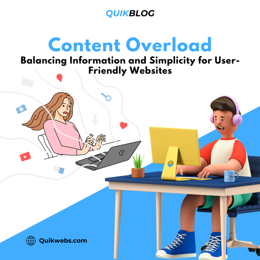
In the ever-expanding digital landscape, where information is abundant and attention spans are shrinking, creating a user-friendly website has become more challenging than ever. The delicate balance between providing valuable content and overwhelming visitors with information requires a strategic approach. In this blog post, we’ll delve into the challenges of content overload on websites and unveil techniques to achieve a harmonious blend of information and simplicity.
Understanding the Perils of Content Overload
Modern websites often grapple with an excess of information. While the intention is to offer comprehensive insights, the unintended consequence can be overwhelming visitors. Here are some common pitfalls associated with content overload:
-
High Bounce Rates: Visitors may quickly leave a website if they feel bombarded with too much information, leading to high bounce rates.
-
Reduced Engagement: Excessive content can lead to cognitive overload, hindering users from engaging deeply with the material.
-
Poor User Experience: Navigating through cluttered pages can result in a frustrating user experience, impacting the overall perception of the brand.
Strategies for Achieving the Right Balance
User-Centric Content Design
To create a user-friendly website, prioritize the needs of your audience. Understand their pain points, preferences, and the information they seek. Tailor your content to meet these specific needs, ensuring a more personalized and relevant experience.
Visual Hierarchy and Formatting
Employ a clear visual hierarchy to guide users through your content. Use headings, subheadings, and bullet points to break up text and make it more digestible. Well-formatted content enhances readability and comprehension.
Quality Over Quantity
Focus on delivering high-quality, relevant content rather than overwhelming visitors with sheer volume. Concise, well-crafted messages can often convey more than lengthy paragraphs.
Progressive Disclosure
Implement a progressive disclosure strategy by revealing information gradually. Use interactive elements such as accordions or tabs to present additional details when users express interest, preventing information overload upfront.
Smart Use of White Space
Embrace white space as a powerful design element. Adequate spacing between elements allows the content to breathe, enhancing clarity and making the overall design more inviting.
Multimedia Integration
Balance textual information with multimedia elements such as images, videos, and infographics. Visual content not only adds interest but also conveys information more efficiently.
Regular Content Audits
Conduct regular content audits to assess the relevance of existing material. Remove outdated or redundant information to keep your website fresh and focused.
Striking the Right Chord
In the dynamic world of web design, finding the equilibrium between information and simplicity is an ongoing process. By adopting user-centric design principles, employing visual strategies, and embracing quality over quantity, your website can effectively combat content overload. A user-friendly website not only enhances engagement but also cultivates a positive digital experience, fostering lasting connections with your audience.
Ready to work with us?
Whether you’re a startup looking to make your mark or an established business in need of a digital revamp, we’re ready to collaborate and create something remarkable together.